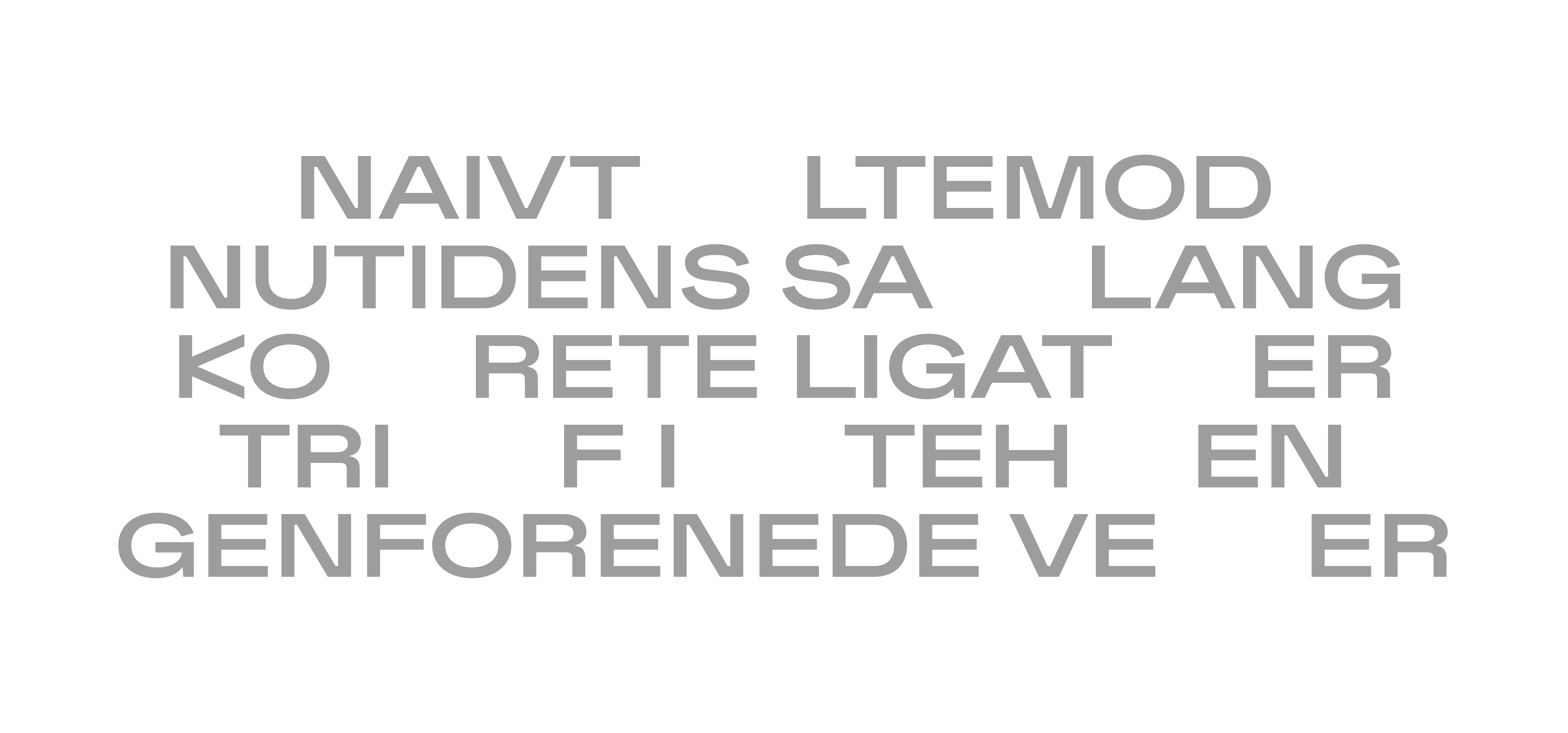
Developing the visual language and brand identity for Maltfabrikken we dove deep into the history of the old factory, The Red Lady, Maltfabrikken. With its many nooks and crannies, it was important to convey the oddities, the fusions, the humanistic and the architectural.
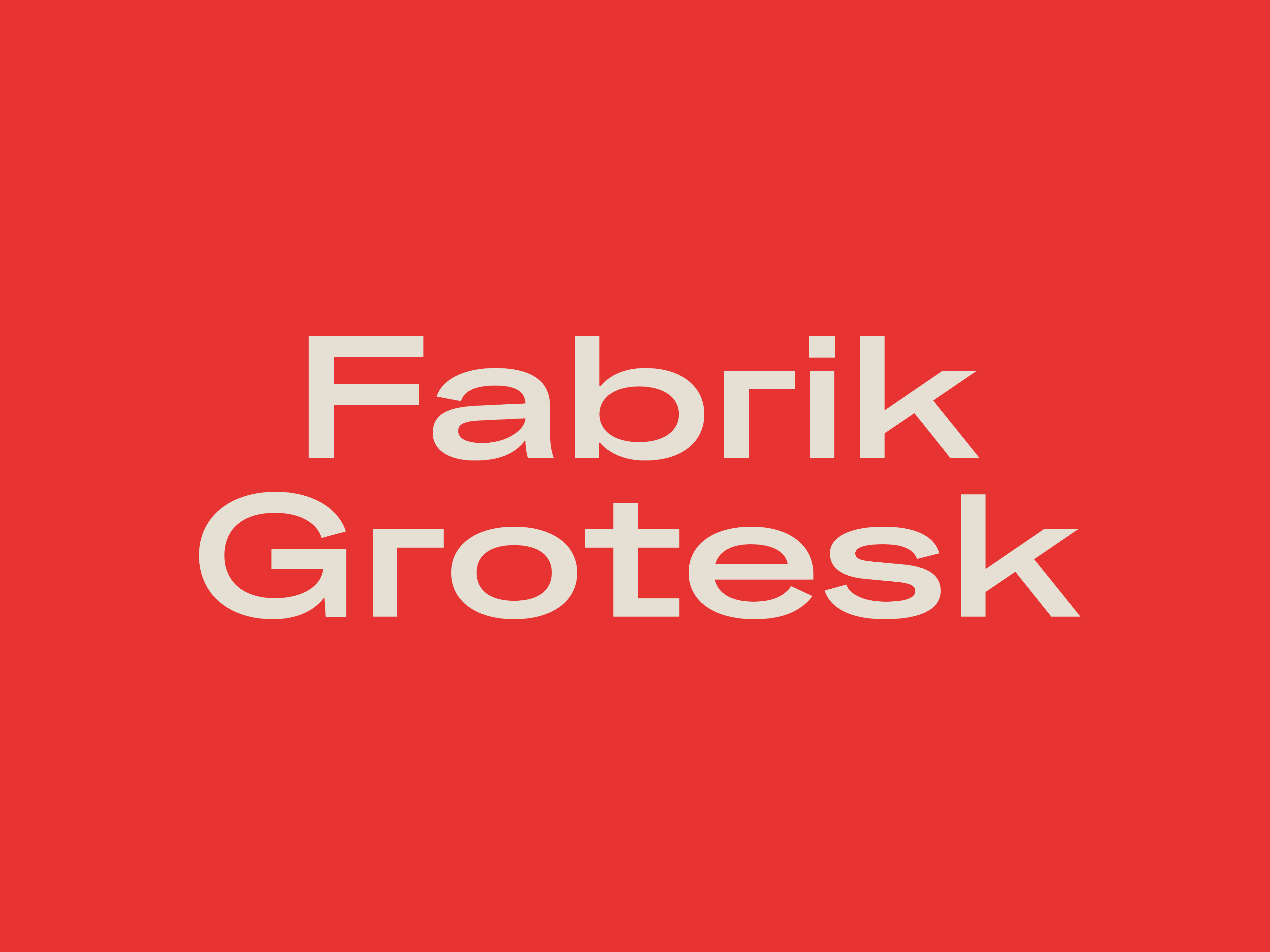
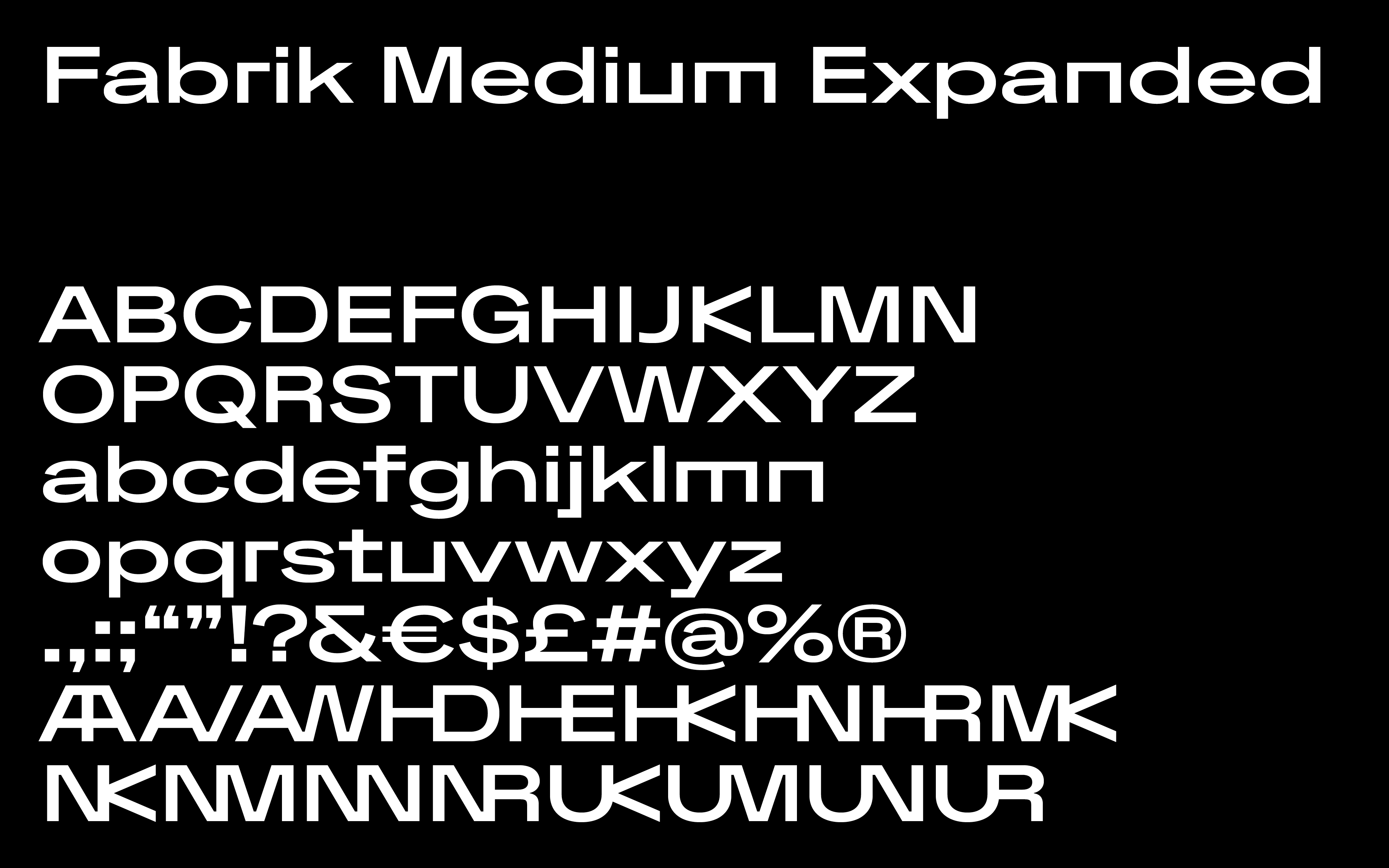
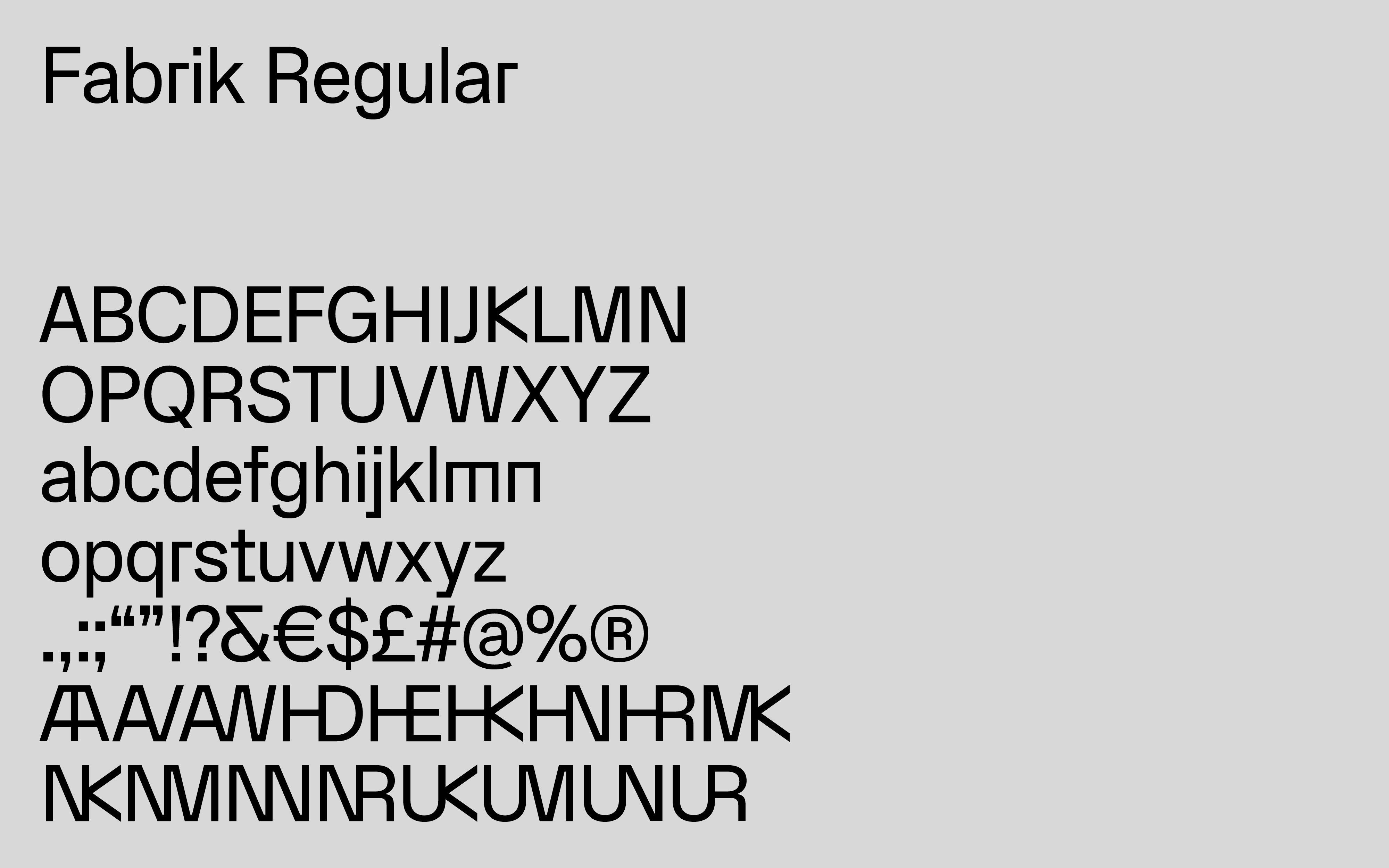
With its different styles Fabrik works both as a characteristic and insisting headline and as a quieter, readable body text.
Inspired by both Swiss typography and the cultural heritage of Danish design, it combines the industrial with the open and humanistic, supporting a many-faceted space with roots in history.


